Thursday, May 5, 2011

The Final Project- Recycled Materials.


The Recycled Army Tank

              I first started off this project in a completely different direction.  Since I had a lot of recyclable cans, I wanted to cut them and create something big (as usual) and interactive.  But as soon as I started working with the cans, I quickly realized they were not an easy material to play with.  Even the sharp box cutter couldn't compete with the can's material.  So.. after a quick moment of thinking, I decided to take a different approach.  Instead of altering the cans, I would use them to my advantage as a whole.  Therefore, I decided to construct a tank.  This inspiration mainly coming from the color green of the Mountain Dew cans.. and that of the Canada Dry bottle.  I thought I could easily transform these into some playable army toy.

            Even though when I was younger I was very much into stuffed animals and soft cuddly toys, I also had a thing for building cars and machines out of Knex or legos, etc.  So building a tank was kinda like going back to childhood to a certain extent.  So I took the cans and tried to glue them together.  But... I quickly realized this was another fault of the cans.  They did not stcik together easily.                                                      
                So I took my long lost friend (ducktape) and decided it would work a lot better.  I wrapped the bottom of the cans all the way around, keeping them in a straight line.  From here I repeated it... (for two sides of the tank).  Cut the canada dry bottle's bottom off and reinforced it back into the bottle, then decided to paint it half green.  From here I also constructed the base of the tank using leftover cardboard.  Also mounting the top of a can i had previously cut off to serve as the door of the tank.  In the end I used green, brown, and black paint to help the tank have a better appearance.  Overall I think the paint enhanced the piece the most.  Otherwise it would lack in tank appearance.  And in a last minute decision, I decided to paint over the blue tape with green paint.

             I must admit its not my best piece of the semester, but it was challenging working with cans.  And I'm at least proud I constructed something out of this hard to use material.

Tuesday, April 26, 2011

Polyhedral Mask and Cube Sculpture

PHASE ONE: THE MASK

         I decided to use three different polyhedrals.  I started off with a rhombus-based pyramid.  I thought this shape would be good because it covers the entire face and would allow space to build off of.  Second... I used a triangular prism to create a 3D effect on the teeth of the mask.  Third, I used three square-based pyramids, leaving them un-enclosed so that it could have a spiky effect.  I then covered the shapes in black and silver paint because I wanted them to look sleek, shiny, and dark.  I also used mirrors and shiny rubies to enhance this effect.  Overall I am satisfied with the piece.


PHASE TWO: THE SCULPTURE


          For Phase Two of the Polyhedral project, I had to create a sculpture (because I'm an Art Major).  I instantly decided I wanted to work with Cubes because they are easy to construct (which would allow me more time to elaborate with paint and other values).  I also wanted to work with Cubes because of the Square mirrors I had previously worked with.  I wanted to use them again.

          My original idea was to construct a series of towering boxes that looked like they were "melted" together.  Luckily, this idea came to life with no problems.  I cut out the sheets of foam board, created the boxes, and with a few cuts... created the illusion of the boxes colliding/intertwining.  To go with this melting concept, I decided to use paint that reminded me of 1. A nuclear meltdown and 2. Space.  The black parts with yellow/green splatter represent space, and the black and yellow melting are more of the nuclear meltdown scheme.  Although, the green from the "space" concept also adds to the nuclear effect.  Overall, I am very happy with the finished product (despite its white trim, sorry!).


Monday, March 28, 2011

Abstract Book and Serial Planes

Phase A: Altered Books:


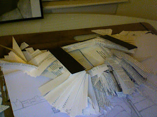
    The initial phase of this project was to take a book and turn it into an art form that didn't resemble a book anymore.  I first started this project by researching ideas/ and previous artwork done with books.  Using google, I was able to see a variety of work with the altering of books, but none that exactly sparked my interest.  After sitting down and sketching ideas, I came up with the main idea of having a book which contained no pages.  The book would appear as if the pages had been blown out of it
         After getting a decent sketch down, I started to cut and alter my book.  I chose a hard cover so I could create something free standing (using the hard edges to prop the book up).  I soon noticed that my plan wasn't going to be as easy as I thought.  Not only was it hard to control how many pages my blade went through, but the cover of the book was also very fragile.  Soon enough.. my plan was flawed when a cover piece broke off completely.
          From here I decided to alter my plan and go back to the sketchbook.  My design no longer would create an X with the cover in order to keep it open.  My new design would keep the book propped up as if it were in a bookshelf ... or put against the wall.  The four legs (left) of the cover would keep it standing, resembling a flat V on the tabletop.  After I defeated the main difficulty of keeping it standing, the rest was simply tedious work of bending and folding pages in order to create an abstract "blown out" feeling.  After cutting through the entire book and folding for what seemed an eternity, I finally came out with a successful abstract piece.

Phase B: White Serial Planes Sculpture/ Object


          With Phase B, we were instructed to create a serial planes project out of foam board.  The purpose of this project was to satisfy a scale of 12 x 12 inches.   When I first started this project, I instantly began to think about structures outside of skyscrapers.  Something modern, sleek, and big in scale.  After researching "serial planes" through google, I decided to sit down and sketch ideas.
         After a few trial errors, I finally came up with a design I was satisfied with.  The sketch was built off of several ideas.  The main piece of the structure would resemble my desk at home, which also resembles a painting palette.  This piece would be angled by three curvilinear triangles.  
         When the main structure of the piece was complete, I decided it also needed an extra touch.  I then created a base which looked like streaks and blobs of paint.  I then made slits o the main "paint palette" piece in order to give it a modern look (and allow for a more see through appearance).  I found cutting slits like this (and cutting foam board in general) very difficult.  It was hard to be accurate and smooth with the cutting blade.  I also added to the piece by cutting out flat shapes (triangles and squares mostly) and gluing them above the cut slits.
          When all the pieces were complete, the three triangles were slid into the base.. and the palette was placed at a secure angle.  Overall I think the piece was successful in scale and in abstract form.


Tuesday, February 15, 2011

Ice Cream Write Up

         Creativity has many definitions.  But to me, creativity is the freedom to express yourself however you desire.  Whether its painting on canvas, sculpting out of clay, or cutting up a box into an ice cream, creativity allows you to do what you please.  This happens to be one of the main reasons I love art.  Regardless of what you construct, you can't be "wrong".
         I started off my project with a red, white, and brown JcPenny box.  I chose this box mainly because it had three different colors.  I wanted to create something that had personality, and I thought the easiest way to do this was with color.  I also chose this box due to the material.  It was a flimsy box that would be easily cut and also bendable.  This would allow for easier construction of curved shapes, particularly with the Ice Cream cone. 
         I had a couple ideas before I came up with the ice cream cone.  I first brainstormed about different animals and tree designs.  But overall, I didn't find these ideas interesting enough to persue.  Since I am one of those people who is constantly hungry, I began to brainstorm about food ideas.  One of the first ideas I came up with was the Ice Cream Cone.
         When I first started to construct the Ice Cream Cone, my main concern was the bottom of the project.. and the scale.  At first I considered making the bottom of the cone.. like a waffle cone (a cone shape).  But I realized .. my project wouldn't be able to stand up on its own, thus making it weak.  I then decided to make it a cylinder shape.  From here I started to construct the top (wider) cylinder and the ice cream from the inside of that.
          I created the ice cream by cutting strips of rectangles from the box.  I used these rectangles to arch the strips from one side of the top cylinder, to the other side of the cylinder.  After I had arranged the rectangles all throughout the circle.. it had created the top of an oval.  I also constructed this oval in a certain order so that it had personality.  The different colors and added textures (on top) helped to add a "wow" factor to the piece.
         Overall I enjoyed the project.  Its not often you have a "challenge" of using only a certain amount of material.  The challenge of taking an object.. and creating it into something that doesn't resemble the original was also a challenge.  I think the Ice cream cone completes the task of being "Anything but the box".

-Ethan Tyler

Completed Project:

Monday, January 31, 2011

Day One

I've officially started my Basic Design 2 Blog.

-Ethan Tyler